The Canvas Accessibility Checker allows you to identify and amend common accessibility issues while working in the Canvas content editor.
Open a Canvas page or assignment and select "Edit".
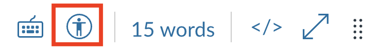
Click on the Accessibility Checker icon to bring up a list of accessibility errors it has found.

Each issue explains why it failed the accessibility check and gives you options for correction.
Use the "prev" and "next" buttons to scroll through the list of issues.
Click the "apply" button to submit your accessibility corrections.

More information about alt text can be found here.
Applying alt text in Canvas
- For new images
- click on the image icon in the content editor toolbar to insert a new image

- For existing images, or to change the alt text or image size
- click on the image itself
- then click on the label "Image Options" under the image
- the dialogue box will open
- type your alt text in the provided text box

Image options menu items:
- Alt text: Good alt text succinctly describes an image. Alt text is often read aloud by accessibility tools.
- Decorative image: accessibility tools skip over decorative images. This shortens the time it takes for the page to be read aloud.
- Embed image: The image displays on the same page.
- Display text link (opens in a new tab): Good for very large or complex images, but less accessible. Use "embed image"

Alt text
- Do not use "picture of" OR "image of" in your alt text (accessibility tools automatically say, "image of")
- Change names of files to meaningful labels, similar to alt text: e.g., change a file named "20150721_140127.jpg" to "Millennium Park"
- Keep alt text as short as possible: e.g., "city park" (no quotes)
- Use longer descriptions only when the info is important to your topic: e.g., "Millennium Park in Chicago"
- Meaningful file names act as a fail-safe
Decorative images
- Accessibility tools skip over decorative images. This shortens the time it takes for the page to be read aloud.
- For decorative images, leave alt text box blank and check box "Decorative Image"
An image is decorative if it
- Doesn't convey additional meaning
- Is described by, or illustrates, surrounding text
- Is visual styling only -- "eye candy", dividers, borders, spacers, etc.
Link text helps users understand the purpose of each link before deciding to follow it.
Creating good link text
- Use keywords that can be understood at a glance (reword if necessary)
- Link to text that is specific ("applesauce workshop" vs "workshop")
- Clearly describe the content or destination of the link ("Week 2 Poe Response Paper")
- Don't expose or use URLs as link text
Examples of good vs bad link text
| Usage example | Good link text | Bad link text |
|---|---|---|
| Link slides | Slides for Week 6 lecture. | Slides for Week 6 lecture. |
| Share rubrics | Here is the rubric for the assignment, but don't submit it here. | Here is the rubric for the assignment, but don't submit it here. |
| Redirect for more info | Whales are awesome - more about whales. | Whales are awesome - click here. |
| Redirect for an activity | Sign up for an applesauce workshop | Sign up |
Test your link text
- Read your links
- out loud
- as a list
- without contextualization
- Look away from your screen and say your links out loud again. Do they still stand up on their own?
Heading tags create an accessible structure.
To apply heading tags, use the drop-down menu under "Paragraph" in the content editor.

More about heading tags
- Apply headings instead of using bold or larger fonts to call out topics, or divide content.
- Headings provide an outline of your page content for non-visual users.
- H1 is not available; it is reserved by Canvas for page title.
- Use H2 for section or topic titles, use H3 for subsections.
- Do not use an H3 before you have used an H2.
- Important! Bold and italicized text are ignored by screen readers.
- Word choice is the only way to ensure accessible communication.
- Call out important content for readers.
Examples:
- "Warning! Do not forget to save your progress before clicking the submit button."
- "Please note: the assignment will not go live until tomorrow."
The contrast between the colors of links, text, and page backgrounds can affect users' perceptions of the page content.
Color contrast is the difference in perceived brightness between colors, expressed as a ratio.
Minimum color contrast rules
- 3:1 contrast ratio between the body text and the link text.
- 4.5:1 contrast ratio between background color and both body and link text
- 3:1 contrast ratio for graphics and user interface components (such as form input borders)
Color contrast checkers and tools
Colorzilla: color-dropper tool to identify the color hex #
WebAim: link contrast checker - enter body text, link text color and background color hex #s to see ratios
Colorsafe: color-picking tool, accessible-friendly
Adobe Color: Accessibility Tools to check contrast between text and background colors and allows you to adjust colors until it reaches accessibility
- Click the "ordered and unordered lists" option in the content editor toolbar.
- Ordered lists display as numbered, unordered display as bullet points.
- Always use the content editor tool to create lists
- Lists made WITH the content editor tool are read aloud by accessibility tools.
- Lists made without the content editor tool may not read aloud by accessibility tools.
- Organize information and orient readers.
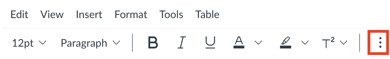
- In the rich content editor, click the 3 dots "more" icon
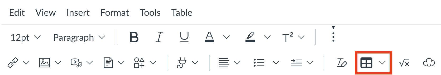
- Click the "tables" icon and select the "table" item in the sub menu.
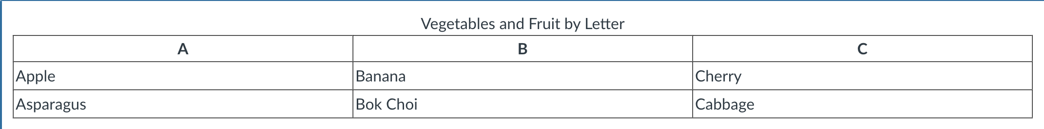
- Fill out your table cells. Include an extra row or column for your table headers.
Note: avoid merging cells. - Click the Accessibility Checker icon to insert a table caption and header.
- Click "apply" and "save" to implement your caption and header


Please ensure that all PDFs are accessible by giving each a quick one minute accessibility test that they can be read out loud:
- Open a PDF document with Adobe Reader.
- Go to the View menu
- Select “Read Out loud”, then select “Read this page only” or “Read to the End of the Document”
- Listen to your document being read.
- Make sure that images have identifying text explanations that are also read out loud.
- Alternatively, you can leverage Harvard Library’s resources to meet accessibility standards.
- Library staff will locate or generate digital copies of requested materials and link them to your list in Library Reserves of your Canvas Course Site.
- Visit Harvard University IT's guide on creating accessible PDFs
Visit Harvard University IT's guide on creating accessible documents
Instructor support
Email: dce_instructionaltechnology@fas.harvard.edu
Web: teach.dce.harvard.edu/itg
Emergencies: call the help desk at (617) 998-8571
Student support
Support for students is provided by Academic Technology
Email: AcademicTechnology@dce.Harvard.edu
Phone: (617) 998-8571
Resources: Canvas Student Support Guides & Tips